MaxCFG Menu Editor
Editing BBS menu definitions with the MaxCFG menu editor
The menu system is the face of your BBS — it’s the first thing callers interact with and the last thing they see before logging off. MaxCFG’s built-in menu editor lets you design, tweak, and preview your menus live without ever leaving the configuration tool. You can see exactly what your callers will see, with full ANSI art rendering, lightbar colors, and layout — all updated in real-time as you make changes. Hit F3 from any menu form and there it is. (Jump to Live Preview details.)
Each menu lives in its own TOML file under config/menus/ (e.g., main.toml,
message.toml, file.toml). No compilation step, no separate tools. Open a
menu, change a title, add an option, save, done.
Opening the Menu Editor
From the maxcfg main screen, navigate to:
Content → Menus
MaxCFG reads the menu TOML files from config/menus/ and presents every defined menu in a list.
If you’re coming from another BBS package or setting up Maximus for the first
time, you’ll find a set of default menus already in place — MAIN, MESSAGE,
FILE, CHANGE, EDIT, CHAT, and so on. These are a good starting point; you can
rename, rearrange, or replace them as you see fit.
Menu List
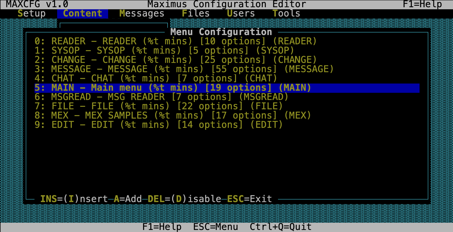
Each entry shows the menu name, the title your callers see, and how many options it contains.
| Key | Action |
|---|---|
| Enter | Edit the selected menu |
| Insert | Create a new menu |
| Delete | Remove the selected menu (asks for confirmation first) |
| Esc | Save all menus back to their TOML files and exit |
Menu Properties
When you select a menu, the properties form opens. This is where you set the basics — what the menu is called, what files it displays, and how wide the auto-generated option list should be.
| Field | Type | What it does |
|---|---|---|
| Name | Text | The internal menu name (e.g., MAIN). Must be unique across all menus. |
| Title | Text | What callers see at the top. You can use %t for time remaining, and other Maximus tokens. |
| HeaderFile | File | A display file shown once when a caller first enters the menu (think: a welcome banner). |
| HeaderFile Types | Multiselect | Which help levels see the header: Novice, Regular, Expert, RIP. |
| MenuFile | File | A custom ANSI/BBS file that replaces the auto-generated option list. This is how you get those beautiful full-screen menus. |
| MenuFile Types | Multiselect | Which help levels see the custom menu file. |
| MenuLength | Number | How many screen lines your MenuFile takes up. Maximus needs this so it knows where to put the prompt. |
| OptionWidth | Number | Width for each option in the auto-generated list (6–80, default 20). |
| HotColour | Number | Color code for hotkey highlighting (-1 = none). |
| Customize… | Action | Opens the customization sub-form — this is where the magic happens. |
| Menu Options (N defined) | Action | Opens the option list editor. |
The big feature: Press F3 from this form for a live preview of exactly what your callers will see.
Customization
Here’s where Maximus NG really shines. The customization sub-form lets you combine a full-screen ANSI art background with Maximus’s auto-generated option list — positioned, colored, and laid out exactly the way you want. You can build menus that look like custom ANSI art but still have Maximus handle the option rendering, hotkeys, and even arrow-key lightbar navigation automatically.
If you’ve ever wanted the look of hand-crafted ANSI menus without maintaining them by hand every time you add an option — this is it.
For the full deep-dive on how hybrid menus work, see Lightbar Menus and Canned & Bounded Menus.
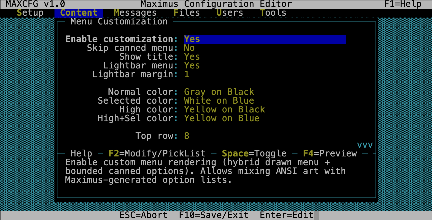
Toggles
| Field | What it does |
|---|---|
| Enable Customization | Master switch. Nothing below takes effect until this is on. |
| Skip Canned | Don’t generate the option list at all — your MenuFile is the entire menu. Useful for pure ANSI art menus where you handle everything with hotkeys. |
| Show Title | Print the menu title inside the bounded area. |
| Lightbar | Enable arrow-key lightbar navigation. Callers can arrow up/down through the options instead of typing hotkeys. |
| Lightbar Margin | Padding (in characters) around each lightbar item. A little breathing room goes a long way. |
Boundary
The boundary defines a rectangle on screen where the auto-generated option list appears. Think of it as a window cut into your ANSI art. Coordinates are 1-based (row, column).
| Field | What it sets |
|---|---|
| Top Row / Top Col | Upper-left corner of the option area |
| Bottom Row / Bottom Col | Lower-right corner |
| Title Row / Title Col | Where the menu title text goes |
| Prompt Row / Prompt Col | Where the input prompt sits |
Getting these numbers right is the key to a good-looking hybrid menu. Use the live preview (F3) to dial them in — you can tweak a value, hit F3, and immediately see whether your options land in the right spot.
Layout
| Field | Options | What it controls |
|---|---|---|
| Option Spacing | Toggle | Extra blank line between option rows — gives a more spacious feel. |
| Option Justify | Left / Center / Right | Horizontal alignment of option text within the boundary. |
| Boundary Justify | Left Top, Center Center, etc. | How the option block is positioned within the boundary rectangle. |
| Boundary Layout | Grid, Tight, Spread, Spread Width, Spread Height | How options fill the bounded area. “Spread” distributes them evenly; “Grid” packs them into columns. |
Lightbar Colors
Four color pairs let you control exactly how the lightbar looks. Each one opens a 16×8 color picker when you select it — pick a foreground, pick a background, and you’ll see the result immediately in the live preview.
| Field | What it controls |
|---|---|
| Normal Color | Default text for unselected options |
| Selected Color | The highlight bar on the currently selected option |
| High Color | The hotkey character in unselected options (so it stands out) |
| High+Selected Color | The hotkey character when the option is highlighted |
Colors are stored as named pairs (e.g., “White on Blue”) in the
[custom_menu.lightbar_color] section of the menu’s TOML file.
What It Looks Like in TOML
If you’re curious what all this produces, here’s an excerpt from a real
main.toml with customization enabled:
name = "MAIN"
title = "Main menu (%t mins)"
menu_file = "display/screens/menu_main.ans"
menu_types = ["Novice"]
option_width = 14

[[option]]
command = "Display_Menu"
arguments = "MESSAGE"
priv_level = "Demoted"
description = "Message areas"
modifiers = []

[[option]]
command = "Goodbye"
arguments = ""
priv_level = "Transient"
description = "Goodbye (log off)"
modifiers = []

# ... more [[option]] entries ...

[custom_menu]
skip_canned_menu = false
show_title = true
lightbar_menu = true
lightbar_margin = 1
top_boundary = [8, 8]
bottom_boundary = [20, 61]
title_location = [22, 32]
prompt_location = [23, 1]
boundary_layout = "spread"
boundary_justify = "center center"

[custom_menu.lightbar_color]
normal = ["Light Gray", "Black"]
high = ["Yellow", "Black"]
selected = ["White", "Blue"]
high_selected = ["Yellow", "Blue"]
You never have to write this by hand — the menu editor builds it for you. But it’s nice to know it’s all plain-text TOML if you ever want to bulk-edit or version-control your menus.
Menu Options
Every menu is made up of options — the commands your callers can choose from. The option list shows them all at a glance:
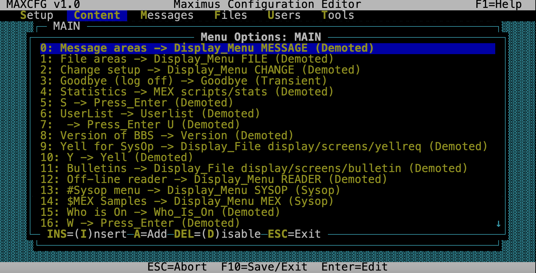
Each line shows the description callers see, the command it runs, and the minimum privilege level needed to use it. Options appear in the order callers see them — the order in this list is the order on screen.
| Key | Action |
|---|---|
| Enter | Edit the selected option |
| Insert | Add a new option at the current position |
| Delete | Remove the selected option (asks for confirmation) |
| Esc | Return to the properties form |
Option Editor
Select an option and you get a form with everything that defines it:
| Field | Type | What it does |
|---|---|---|
| Command | Select | What this option actually does. Opens a command picker grouped by category. |
| Arguments | Select/Text | For Display_Menu, press F2 to pick from your menu list. For other commands, type freely. |
| Privilege | Select | Minimum access level. Opens a picker with your defined levels, or press Space to type a custom string like Normal/1C. |
| Description | Text | The text callers see. The first character automatically becomes the hotkey. |
| Hotkey | Text | Override the auto-hotkey if you want a different key. |
| Modifiers | Multiselect | Special behavior flags (see below). |
Command Picker
You don’t have to memorize command names — the picker groups them by category:
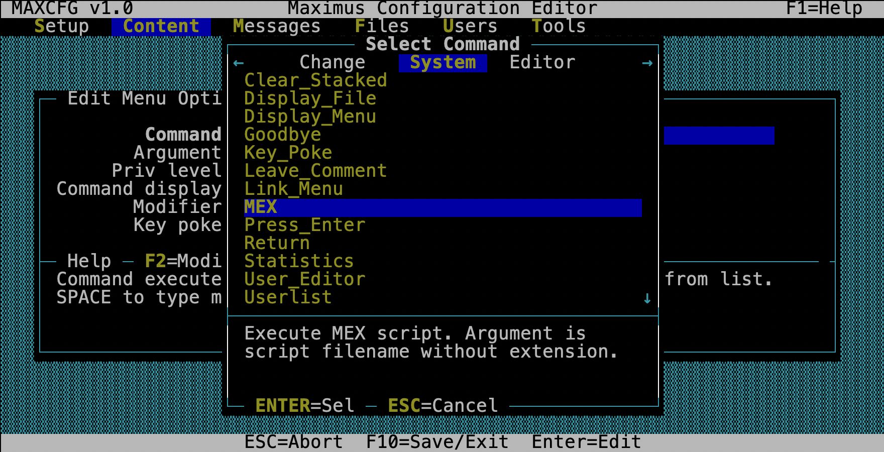
| Category | Examples |
|---|---|
| Misc | Display_Menu, Display_File, MEX, Link_Menu, Cls, If, Return, Key_Poke |
| External | Xtern_Erlvl, Xtern_Dos, Xtern_Run, Xtern_Chain, Xtern_Concur |
| Main | Goodbye, Statistics, Yell, Userlist, Version, User_Editor |
| Message | Msg_Area, Read_Next, Enter_Message, Msg_Reply, Msg_List, Msg_Browse, Msg_Tag |
| File | File_Area, Locate, File_Titles, Upload, Download, File_Tag, Newfiles |
| Change | Chg_City, Chg_Password, Chg_Help, Chg_Video, Chg_Editor, Chg_Protocol |
| Edit | Edit_Save, Edit_Abort, Edit_List, Edit_Edit, Edit_Insert |
| Chat | Who_Is_On, Page, Chat_CB, Chat_Toggle, Chat_Pvt |
Modifier Flags
Modifiers change how an option behaves without changing the command itself:
| Flag | What it does |
|---|---|
| NoDsp | Hides the option from the menu display, but callers can still use the hotkey. Great for secret sysop commands or shortcut aliases. |
| NoCLS | Don’t clear the screen when chaining to another menu (Display_Menu only). |
| RIP | Only show to callers with RIP graphics. |
| NoRIP | Only show to callers without RIP graphics. |
| Local | Only show when the area is a local-style area. |
| UsrLocal | Only show to locally connected users (console). |
| UsrRemote | Only show to remote (telnet/modem) users. |
| ReRead | Re-read the user record after an external program returns. Use this when a door game might change user data. |
Privilege Levels
The privilege picker shows the standard levels defined in your access.ctl:
- Demoted — the lowest level; everyone can see and use the option
- Transient — temporary/guest access
- Normal — your everyday registered user
- Privileged — elevated access (co-sysops, trusted users)
- Sysop — full system access
- Hidden — invisible to regular users entirely
You can also type custom privilege strings with key restrictions. For example,
Normal/1C means “Normal level, but only if the user has keys 1 and C set.”
This gives you fine-grained control over who sees what.
Live Preview
This is one of the best features of the menu editor. Press F3 from the properties form or the customization form, and MaxCFG renders your menu exactly as a caller would see it — right there in a popup window.
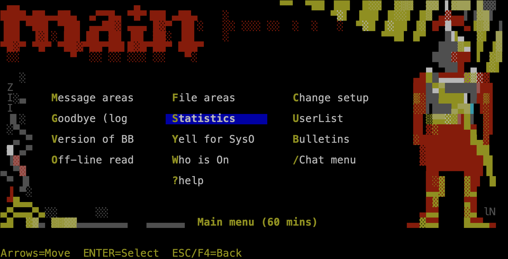
Here’s what happens under the hood:
- If you have a MenuFile (ANSI art), it’s rendered with full MCI color translation — pipe codes, cursor positioning, the works.
- The auto-generated option list is overlaid within your boundary rectangle.
- Lightbar colors and layout settings are applied from whatever you have in the form right now — even before you’ve saved.
- The result pops up on screen.
This means you can tweak a boundary coordinate, hit F3, see if it looks right, adjust, hit F3 again — a fast, visual feedback loop. No more guessing at row numbers, saving, restarting the BBS, and logging in to check. You see it instantly.
Tips
Start with ANSI art. The most impressive menus combine a hand-drawn ANSI background (set as the MenuFile) with a bounded option area. Draw your art in your favorite ANSI editor, leave a blank region for options, then use the boundary settings to fill it in. The live preview makes dialing in the coordinates painless.
Use NoDsp for hidden commands. Want a hotkey that works but doesn’t appear on the menu? Add the NoDsp modifier. This is how experienced sysops add things like quick-jump shortcuts or secret sysop backdoors.
Test at different privilege levels. Options with higher privilege requirements are invisible to users below that level. Your MAIN menu might look quite different to a Demoted guest versus a Sysop. Use the preview to think about what each class of user sees.
Don’t delete the EDIT menu. Maximus requires a menu named EDIT for its
built-in message editor. If you remove it, message editing breaks. You can
customize its options all you want, just keep the menu itself.
Explore the customization features. If you haven’t tried lightbar navigation yet, turn it on for your MAIN menu and see how it feels. Between the boundary system, layout options, and per-menu colors, you can make every menu on your BBS look and feel distinct. See Lightbar Menus and Canned & Bounded Menus for the full story on what’s possible.
See Also
- TUI Editor — navigation keys and field types
- Menu System — how the Maximus menu system works
- Menu Definitions — menu TOML format reference
- Lightbar Menus — arrow-key navigation setup
- Canned & Bounded Menus — hybrid ANSI + auto-generated menus